Custom visualizations in Kibana
Kibana allows the user to visualize the data in the Elasticsearch indices with a variety of charts, tables and maps.
To create a visualization, select Visualize from the left pane menu, then + or Create a visualization, and choose the visualization type that better serves your purpose (e.g. line chart).
In general, charts can be used to plot metric aggregations, e.g. count, average, sum, percentiles, etc., of a search, using some field's value, filters, ranges or whatever tool is more appropriate. For all details on charts and metrics, refer to the docs.
Kibana provides a rather large variety of options to visualize data. Since this guide could not be more exaustive than Kibana User's Guide, here it is more appropriate to show the main concepts and features of visualization with an example.
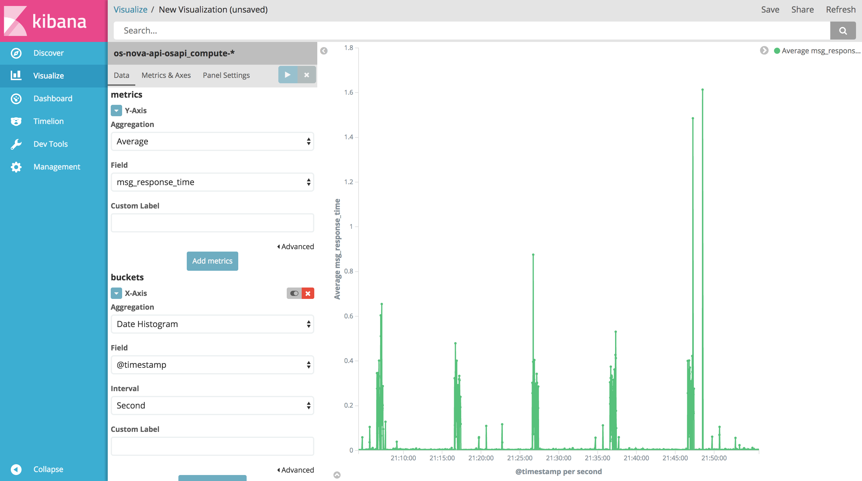
Example: Nova API's average response time
Select Visualize from the left pane menu, then + or Create a visualization, and choose Line to create a line chart. This should lead to a page like the following:
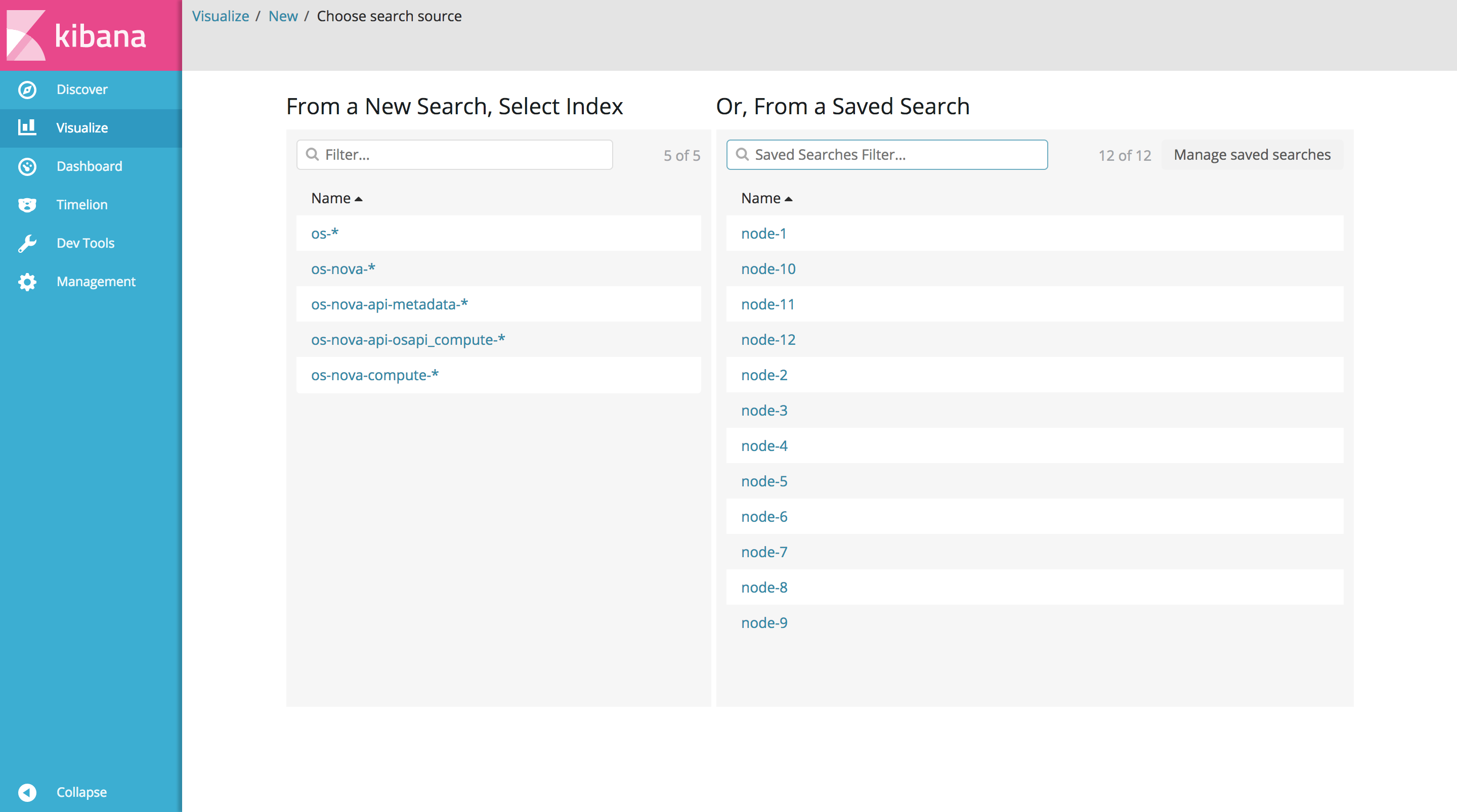
Now select os-nova-api-osapi_compute-* as index pattern (if it does not exist, create it first, in the Management section).
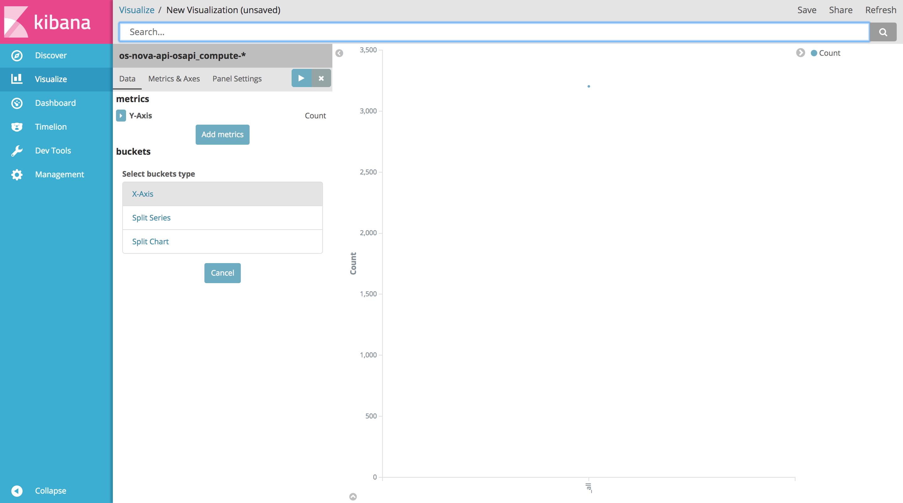
In the metrics section, expand the Y-Axis configuration menu:
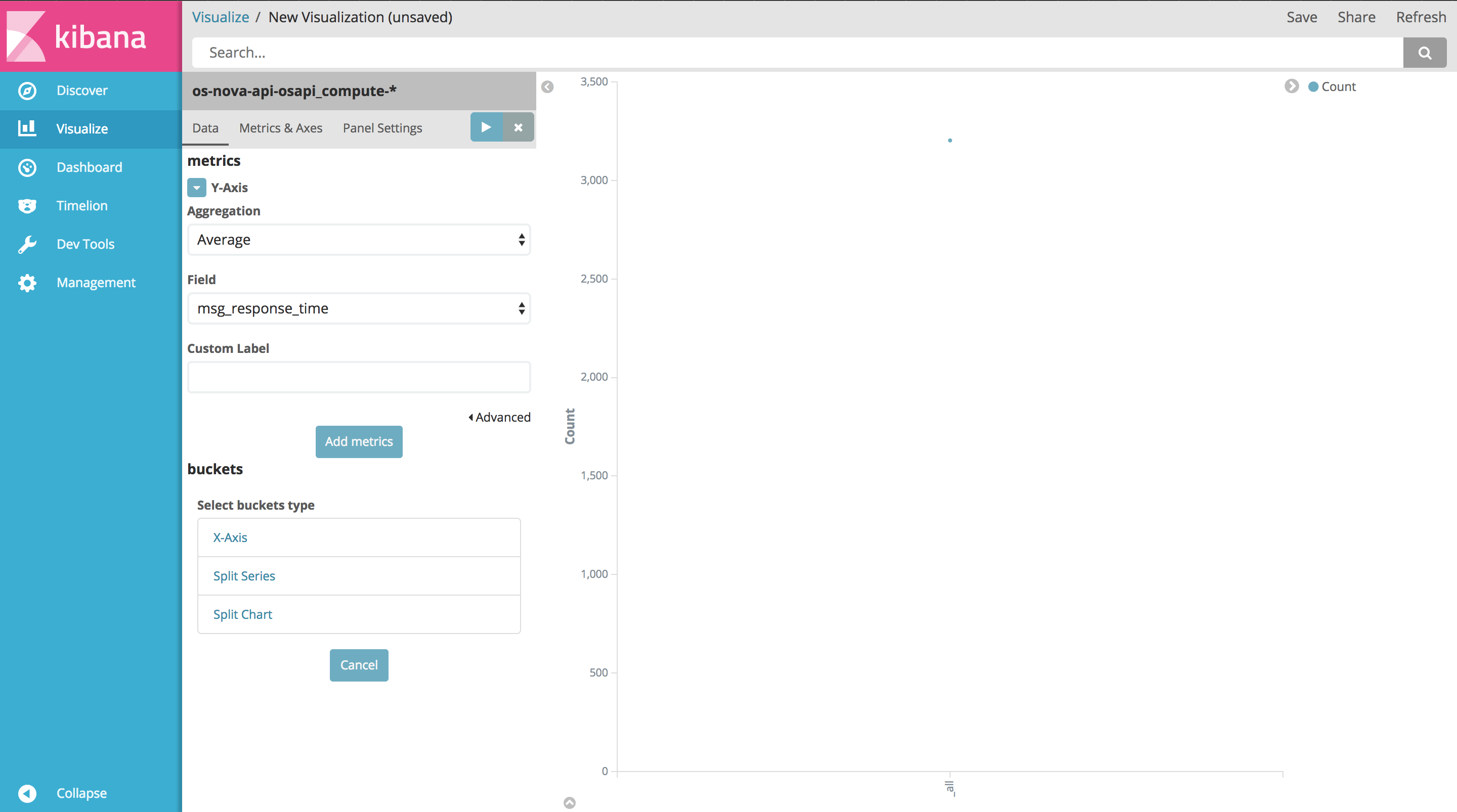
In the Aggregation select menu, choose Average. Then select msg_response_time as field.
Now, in order to display timestamps on the x-axis, click X-Axis in the buckets section:
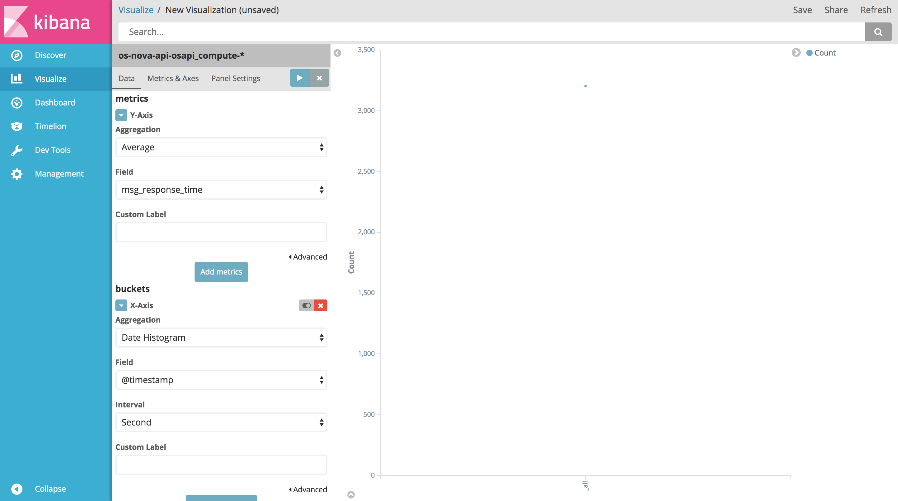
Select Date Histogram as aggregation, @timestamp as field, and Second as interval. Optionally, the axes can be labelled so as to visualize custom names for the axes in the chart.
Now that the required parameters are set, click the Apply changes button on the top right of the pane. The resulting chart will be rendered on the right:
Now that the visualization has been created, it can be saved. Click Save on the top right of the page, give the visualization a name and click Save again.
Saving visualizations allows to reopen them later. Any changes in the dataset will be reflected automatically in the chart as it is reopened or rendered again using the Apply changes button.
Dashboards
Saved visualizations can also be grouped and viewed together in a dashboard. Elements in a dashboard can be resized and rearranged at will. Like visualizations, dashboards can be saved for later use.